Review of the intensified market differences: The rebound turns into a reversal, or the second distribution of the decline relay

Reprinted from panewslab
04/22/2025·1MAuthor: @BlazingKevin_, the Researcher at Movemaker
With the increase in the number of open Bitcoin contracts and the continuous increase in key price points in the clearing map, market differences have begun to intensify. Is it the current rebound to turn into a reversal, or the second distribution of the decline relay?
This is what the author observed from the market. There are many analysts supporting the two mainstream views on the future trend. The two views start from completely different data and perspectives, but if you look closely at the core of their thinking, you can see that the two have different paths and the same destination. The starting point of both is the analysis of supply and demand. Therefore, today's sharing context is based on supply and demand, analyzing and looking at how the views on reversals and secondary distribution are based on the same roots, that is, they all start from the analysis of supply and demand, but they draw completely different conclusions.
The K-line is the trend of the price, it is the most apparent visual graphic of the supply and demand relationship. The increase and decrease of the buying and selling strength constitute the up and down fluctuations of the price. The formation of each K-line is the result of the clash of forces between buyers and sellers, and is a compressed image of the changes in the supply and demand structure. Furthermore, buying and selling have strength, which can be observed intuitively from the trading volume. If you think further, why does the price change? Why retreat at a certain position? Why sometimes breakthroughs fail?
Here the author shares a marble theory to facilitate explanation of the changes in the influence of tariff policies and the level of kinetic energy formed when supply and demand change. Marbles theory is an idea that abstracts the supply and demand relationship into concreteness. The narrow supply and demand relationship can be seen very easily in the order book. Orders with different order volumes form glass of different thicknesses, and each transaction order that is actively traded is a marble with momentum . The process of price change is essentially the process of these marbles constantly hitting the order book, breaking through the glass, and pushing the price forward.
The thickness of glass represents the depth of liquidity and the density of orders at a certain price; the kinetic energy of marbles comes from the volume and speed of active buying or selling. Every advancement of market prices is the result of the price jumping to the next layer after the marble penetrates a layer of glass. If the kinetic energy is strong, it may continuously break through multiple layers of glass; if the kinetic energy is insufficient, it may be stuck in a certain layer or even rebound. When the market fluctuates violently, switch to the 1-minute level and you can find such breakdown marble-like transactions.
This can explain the unpredictability of prices under a short time frame, as it can be seen as a disorderly motion between two thick layers of glass. Compared with "price trend", marble theory emphasizes "driver structure"; compared with predicting K-line, marble theory tries to restore the physical process driven by the price . This is a way of analysis that is closer to the essence of the market. From the appearance of the K-line, countless trading indicators can be emitted based on time and trading volume. Most of these indicators are not in today's discussion, but I will mention the supply and demand relationships in the following content.
Based on the marble theory, the following abstraction can be obtained:
Pending order thickness = depth of a certain price layer
Active Trading = Marble
Trading volume = kinetic energy of the marble
Impact cost = energy loss of marbles through glass
Based on this idea, the following assumptions can be further derived:
The market price does not slide continuously , but jumps in a jump-through price range;
The density of orders at different prices varies , and the thickness difference creates support and pressure;
The greater the active trading, the stronger the momentum , which can drive the price to pass through more "glass layers";
Some orders in the market are "false liquidity" and do not represent true intentions. If a marble hits this type of glass, a false breakthrough will occur;
Price behavior has inertia . When the kinetic energy is too large, it may cause the price to "break through the head", resulting in overheating or overcooling, that is, overbought or oversold.
This is the theory that the author draws from two perspectives and when he has always made trading from his own origins. When making a transaction, you can only look at the k-line, because all supply and demand relationships are hidden in the k-line. If the trading level is high enough, you can only look at the k-line to judge the direction of the supply and demand relationship, as well as the control of the arrival of the critical point. The masters simplify the complexity and the k-line is enough.
Let me give you two simple examples: a long positive line usually means that the buyer's strength will dominate the cycle, demand continues to rise and swallow up the order, and the kinetic energy will strongly penetrate multiple layers of "glass"; while a long negative line reflects the suppressive dominance of supply, the buyer's support is weak, and the price will quickly break down through multiple support levels, and the marble's dynamic energy comes from the strong seller's wishes.
If you cannot see the supply and demand relationship when observing the k-line, you need more assistance from indicators, such as open contract volume, spot premium situation, clearing map, and finding data support to assist your trading from more perspectives. The rebound strengthens into a reversal, or relays the second distribution, are conclusions drawn from their respective perspectives. The former believes that demand is greater than supply, the latter believes that supply is greater than demand, and it is more directly said that the former believes that the bull market is still there, while the latter believes that the bear market has become and will continue to deepen. In terms of somatosensory, more people are optimistic about the rebound and the reversal, that is, more people are not leaving, so I will first introduce the theoretical basis of the first view.
**The first point of view: The rebound is likely to turn into a
reversal**
The first view is roughly sorted out and divided into three categories: different situations where demand is greater than supply. The discussion of the supply relationship from long-term and short-term holders to intensive chip areas comes from @Murphychen888. The views proposed by Murphy will also be widely used below.
First of all, there is the relationship between long-term holders (LTH) and short-term holders (STH). The profit and loss state transition between LTH and STH often indicates an important market turning point. And the first small argument is to observe changes in the profit-loss ratio (LTH-RPC) of long-term holders to capture the market bottom signal. When this indicator shows that long-term holders are beginning to experience general losses, it often means that the market is approaching a phased low.
The index principle is:
- When the profit ratio of long-term holders drops significantly and losses occur, it means that the cashable profit margin is greatly compressed.
- The continued loss state will curb the willingness to sell, and as the seller chips decrease, the market selling pressure will gradually weaken.
- When the selling momentum is exhausted to a certain level, the market will naturally form a price bottom
Historical data support:
- At the bottom of the bear market in 2018 and 2022, the proportion of long-term holders' loss chips reached the range of 28%-30%
- During the extreme market in March 2020, the indicator also climbed to around 29%.
- During a bull market cycle, when this ratio reaches 4%-7%, it usually corresponds to the low point area of the adjustment market.
Current market characteristics display:
- The proportion of losses of long-term holders has risen from nearly zero to 1.9%, close to the level in July 2024
- Considering that Bitcoin purchased at a cost of US$90,000 to US$100,000 from the end of 2024 to the beginning of 2025 will soon be converted into long-term positions (currently in a floating loss state), it is expected that this proportion will continue to rise.
- When the loss proportion enters the threshold range of 4%-7%, more certain layout opportunities will appear
When the vast majority of long-term holders are in a profitable state, each price rebound will trigger profit settlement, forming continuous downward pressure. Historical experience shows that whether it is a bottom of a bear market or a bull market, when long-term holders generally turn to a loss state, it often means that the market is about to bottom out. Because the selling momentum has been fully released at this time, the unsustainable selling pressure will prompt prices to stabilize and rebound. Although the current market has shown signs of "surrender" by some long-term holders, it is still in the left-side layout stage from the perspective of timing, but the potential return may be considerable.
The second small argument is STH-RPC, the profit-loss ratio of short-term holders. Unlike the observation that long-term holders experience losses, the entry on the left is different. The profit-loss ratio of short-term holders is the entry signal on the right, proving that the current demand is much stronger than supply.
Index principle:
- When new short-term participants in the market gradually shift from loss to profitability, it usually means that overall confidence is recovering. This type of change is often accompanied by the reversal of market trends and is a key turning point signal of market sentiment.
Indicator triggers critical point:
- Once the average cost of short-term holders exceeds their holding costs, it indicates that this batch of funds is undergoing a profit and loss reversal. Their profit-taking sentiment will bring stronger buying momentum, pushing prices to continue to cross the previous trading range until the upward trend is neutralized by the selling pressure of long-term investors. Therefore, when the "spend cost line" is crossed on the "short-term holding cost line", it often means that the market is getting warmer and the signal of a trend reversal has appeared on the right side of the chart.
There is no trigger at present, but the yellow line has begun to converge to the blue line. The convergence of the curve based on this indicator is still a left-side entry idea.
The limit deviation pricing range based on the MVRV ratio can also be regarded as glass of different thicknesses. When the overall break-even is reached, it is unwilling to leave the market with more losses, and the downward marble kinetic energy is attenuated. This shows that most market participants are still optimistic about Bitcoin’s long-term prospects and are not shaken by short-term fluctuations. If it is the market atmosphere dominated by "bear market expectations", when prices fall below the key cost line, it will often trigger a series of panic selling instead of the current rapid stabilization state. Based on the current profit and loss pattern of long-term and short-term holders and the trend characteristics of the decline momentum is weakening, it can be inferred that the market is already very close to a local low point, and this stage has a strong left-side entry value.
The second type of view is the supply and demand relationship between stablecoins and Bitcoin, namely BTC-SSR.
The market value of BTC divided by the market value of all stablecoins represents Bitcoin’s ability to grab liquidity from the entire stablecoin pool. The stronger this ability, the higher the probability of price increases, and vice versa.
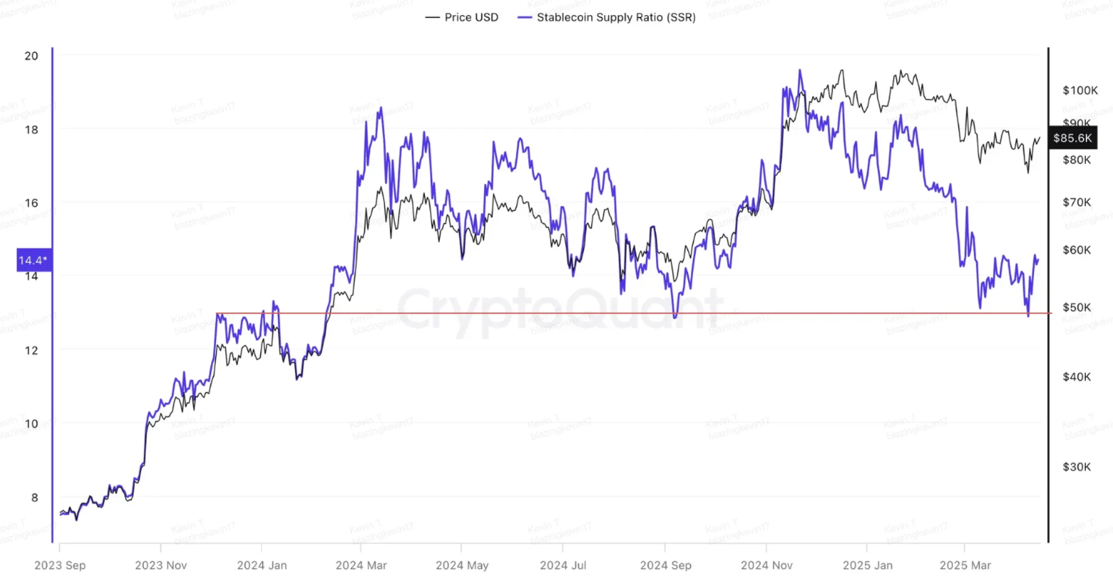
From the BTC-SSR trend, it can be seen that from the market started at the end of 2023, as long as Bitcoin and stablecoins diverge, stablecoins have a great possibility of flowing into Bitcoin, pulling BTC-SSR back into the range. The highs of this figure appeared twice, namely, March 13, 2024 and November 21, 2025, with the corresponding prices being 73k and 98k. The four local lows were on August 5, September 6, March 10, and April 8 this year, and the prices were all local lows. Further observe the comparison between the market value of stablecoins and Bitcoin. Whenever the market value of stablecoins diverges from Bitcoin, BTC-SSR will quickly start to decline until it reaches the proportion when the market starts in 23 years, which means that the momentum of stablecoins flowing to Bitcoin is constantly accumulating, and once it reaches the demand zone, energy will be released immediately. The current market value of stablecoins is still accelerating, and the continuous inflow of stablecoins is very likely to drag down the market value of Bitcoin. The premise is that the bull market exists and the market has not disappeared.
The third type of view is that high and low chip intensive areas will form a double anchor effect
This view still comes from Murphy. We have previously expanded the definition of supply and demand relationship from the narrow sense of order book buying and selling orders to supply and demand for long-term and short-term holders, and then further extend the time dimension. Observe the supply and demand relationship in Bitcoin’s history. Among them, the indicator worth observing is the dense bargaining area.
Index principle:
- The intensive transactions of Bitcoin within a specific price range reflect the recognition and layout of a large number of funds. When falling, those holding coins at high levels are unwilling to cut their flesh to form a "dampening force", which is similar to branches on cliffs, which can delay the price downward speed; on the contrary, those holding coins at low levels have strong bullish expectations and are often willing to hold coins for a rise, like raised stones on rock walls, which can support the price. These two forces are combined to build a key support structure for the market.
Historical data support:
- In June 2024 , Bitcoin gathered about 8% of its chips in the range of $39,000 to $43,000, forming a clear support zone; while 12% of its chips were piled up between $60,000 and $68,000, forming a strong resistance band. During the period from July to August, when encountering external shocks (such as the German government's sale of BTC and the Japanese yen arbitrage transaction cover), the price fluctuated between $43,000 and $60,000, showing that these two chip-intensive belts have successfully built a buffer zone. Especially on August 5, 2024, BTC's minimum correction was $49,000, which fell between two dense areas, confirming the natural anchoring effect of the chip structure on price.
- In November 2022 , the FTX incident triggered a market liquidity crisis, but the BTC price remained stable between the two high-density areas of $6,000-$10,000 (13% of chips) and $18,000-$22,000 (19%). It fell to $15,500 on November 9, which was just stuck in the middle of these two levels, reflecting that even in extreme panic, the chip structure can still provide stable support.
Failure cases where there is no anchoring effect:
- In March 2022 , BTC fell from the $69,000 high and sold sideways around $35,000-$45,000 for nearly two months. At that time, there were serious differences in the market. Some people thought this was a bull market adjustment, while the other part judged that the bear market began. However, from the perspective of chip distribution, there is no centralized position formed below the price, and the chips are evenly distributed within the range of $25,000 to $66,000. The real support capacity of chips is far from $6,000-$12,000. As a result, under the leadership of panic, the price quickly fell below the sideways range and was finally confirmed to enter a bear market.
Current status:
- Currently, about 11% of the chips are gathered in the two intervals of $60,000-$70,000 and $93,000-$100,000, respectively, forming a structure of up and down symmetrical. If we refer to past historical performance, this distribution pattern has the ability to limit price fluctuations to the range of $70,000-$93,000. As long as this chip structure is not destroyed, the "consensus center" of the price axis will most likely be re-established between these two dense areas. The anchoring theory can also be explained by the marble theory, so that the kinetic energy of price fluctuations is like a tense rubber band. When the price moves towards the low chip dense area, the upward kinetic energy can continue to accumulate, and before touching the low chip zone, it will be stimulated upward and rebound. Therefore, $70,000 will become the core support that is not easy to fall below this cycle.
After analyzing the view that the current rebound has turned into a reversal, we discuss the impact of tariffs in this process. Let’s talk about the conclusion first: the impact momentum of a single event on the market will gradually decay when the event will not deteriorate further.
This round of market adjustments caused by tariff policy expectations can be divided into three stages: February 25 to 28, March 10 to 13, and April 7 to 10.
Based on the behavior of investors transferring loss-making assets to Binance during the decline, the impact intensity of the market can be more objectively quantified. Data shows that the achieved loss scale in the first phase reached US$139 million, far higher than the subsequent two phases, at US$43.92 million and US$58.9 million respectively. Such behaviors show a significant decreasing trend on the chain, indicating that the market has suffered the greatest psychological impact in the early stage. Although there are still panic reactions in the subsequent stages, the amplitude tends to converge.
A violent sell-off brings prices back to demand zones, and Trump is likely to not release negative signals that exceed the past in tariffs. Tariffs are raised high and gently fallen for most countries, with limited destructive power. The 10% reciprocal tariff has achieved its goal. Trump cannot withstand the further sale of US bonds in 10 years, and can only operate within the scope of panic that does not cause US bonds to sell. The destructive power is further controlled, and the buff added by tariffs to the supply side will begin to fail, and the downward momentum will begin to decay. Therefore, market sentiment is gradually eased, short-term holders will gradually make profits, long-term holders' selling pressure is far from coming, and a large number of stablecoins may flow into Bitcoin. This is the basis for supporting the current rebound that may be strengthened into a reversal, and the attractiveness of entry on the left is increasing.
**The second view: the current rebound is the second distribution after
the funding is absorbed**
This view believes that the current stage is the relay of the decline towards a long-term bear market. The macro discussion is that the inflation caused by taxes is intensifying, which is moving towards stagflation, thereby accelerating the possibility of recession. However, the core of this view is that the US stock market has entered a technical bear market, and the continued decline of US stocks is inevitable, and Bitcoin cannot be kept alone and does not have independence. It will be dragged down by US stocks. Therefore, here is a basis for how to determine that the US stock market has entered a technical bear market.
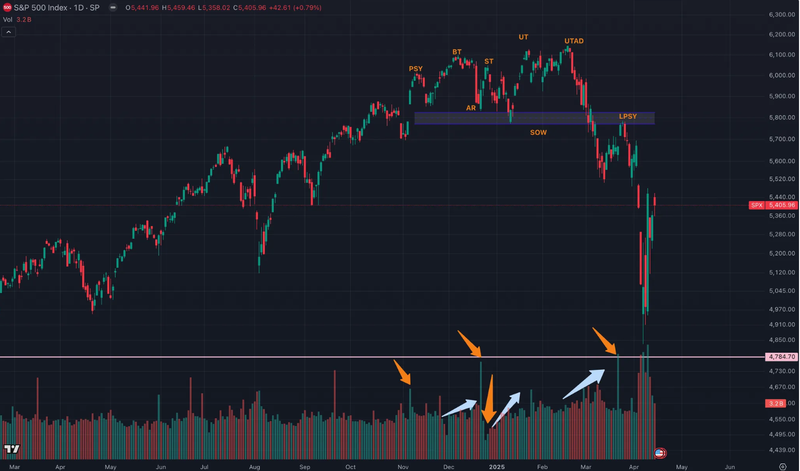
The second type of view believes that the trend of US stocks in the past few months is completely in line with the Wykov-distribution stage. The author explains this view based on the price and the corresponding trading volume, that is, the volume and price behavior. The yellow arrow pointer in the picture requires attention to the pattern of daily trading volume; the light blue shoulder pointer needs to pay attention to the pattern of trading volume over a period of time.
On November 6, the price began to rise sharply, and the transaction volume increased, marking that the temporary high point was about to arrive. Here is PSY – the initial supply point.
From late November to early December, the climax of BC's buying: also known as the buying dense area. The trading volume and price spread have expanded significantly, and the power of selling has reached its peak. Near the top of the market, the public's eager large number of buying orders were satisfied by the large number of sell orders from the main force.
On December 18, AR naturally fell after the buying climax, and the buying orders were almost exhausted, but the selling orders continued, so a natural decline occurred. The lowest point of a natural decline helps define the market bottom of the distribution trading range.
The large-scale buying on December 20 is the first time to absorb funds, that is, the ST secondary test: after a natural decline occurs, the price rises again to the vicinity of the purchase climax area to test the supply and demand of the price near the purchase climax area. When the price approaches the resistance zone of the purchase climax, the volume should decrease and the spread should narrow, which means that the supply will be greater than demand and the price top is confirmed.
SOW weak signals appear from the end of December to early January: Weak signals usually occur at the end of distribution, when the price falls to the bottom of the distribution range, or slightly breaks through the bottom of the distribution range, which is often accompanied by an increase in trading volume and an expansion of price spreads. A weak signal means that supply controls the market.
Between January 13 and January 23, UT is upward and fallback: the appearance of upward and fallback is to lure the last wave of buyers to continue to enter the market and to break down the stop loss set by shorts entering the market in advance. A price sprint is a price stopping behavior, but it gives the public the feeling that the price must break through the range resistance upward, because the main force does not want the public to see that the price is about to fall.
On February 19, UTAD surged and fell backwards: it was the main force's final test of the newly generated demand after the price broke above the range resistance line.
From February 19 to early March: Demand is falsified, and the amplified transaction volume is accelerating.
On March 25, the last supply point of LPSY appeared: Even if you buy in large quantities, after SOW tested the support of the ice line, the price rebounded weakly and the price spread narrowed. These all show that it is difficult for the price to rise. The difficulty in price increases may be due to demand being exhausted or supply controlling the market. The final supply point is the last wave of distribution of the main force before the rapid price decline.
The price pattern and corresponding trading volume amplification or reduction in US stocks are fully in line with Wykov's distribution theory. It proves that the US stock market has completed the sprint at the end of the bull market and the distribution has been completed. Next, you need to find the LPS, that is, the last support point, to achieve the goal of turning bears into bulls. Before this, it was a long trap and you should short at highs.
The difference between the two mainstream market views can be seen as expectations of US stocks and the possibility of Bitcoin decoupling US stocks: that is, if US stocks cannot stop falling, will Bitcoin be able to survive alone; or whether US stocks can bottom out here, and Bitcoin will rebound first.
Market differences are further intensifying. Which view do you agree with?